The Upshot is a data journalism site run by the New York Times. Looking through it, they’ve done some amazing, non-traditional graphics. I want to highlight two and make a very particular point about graphics in general.
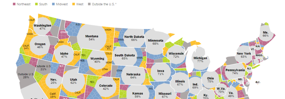
Mapping Migration in the United States

You should really click on the link and see this in full. It’s a kind of treemap (like the last post I did), but instead of using boxes, they’ve actually worked each map into the shape of their states. Coding this must have been a fun challenge and I don’t think I’ve ever seen a map like it.
But does it work? Eh. I have my qualms with it. The nontraditional shapes are very interesting to look at, but it’s hard to actually judge sizes – look at Wisconsin and Texas’ proportion of natives (the big grey circle). Even though 72% of Wisconsin’s population is native-born, its circle is smaller than Texas’ 61%. That’s obviously an artefact of Texas’ sheer area compared to Wisconsin, but it’s still a little weird.
That’s not to say it’s all bad. The tooltips and zoom function help. Plus it’s backed up by some other, more traditional graphics that are a little easier to read.
What 2,000 Calories Looks Like
On the other hand, you have this story. Still from The Upshot. The article is about how much you have to eat to get 2,000 calories from different restaurants. The beautiful thing about it is that, instead of trying to use some abstract number or bar graph, The Upshot just shows you the food.

It’s simple, evocative, and, in the end, easier to understand than any symbol or number. I’ve been eating food all my life [citation needed], I just intrinsically know what looks like a lot.
So what’s the upshot of The Upshot? Novel visualizations should be celebrated for their experimental attitude, but a data story doesn’t need a complicated presentation to be a great story.
